


QNRI Charting
How to Read This Chart
This chart compares inspection results with systemic risk across six real pilot properties. Each dot represents one property assessed during or after a NSPIRE inspection.This chart compares inspection results with systemic risk across six real pilot properties.
Each dot represents one property assessed during or after a NSPIRE inspection.
The Horizontal Axis (Left → Right):
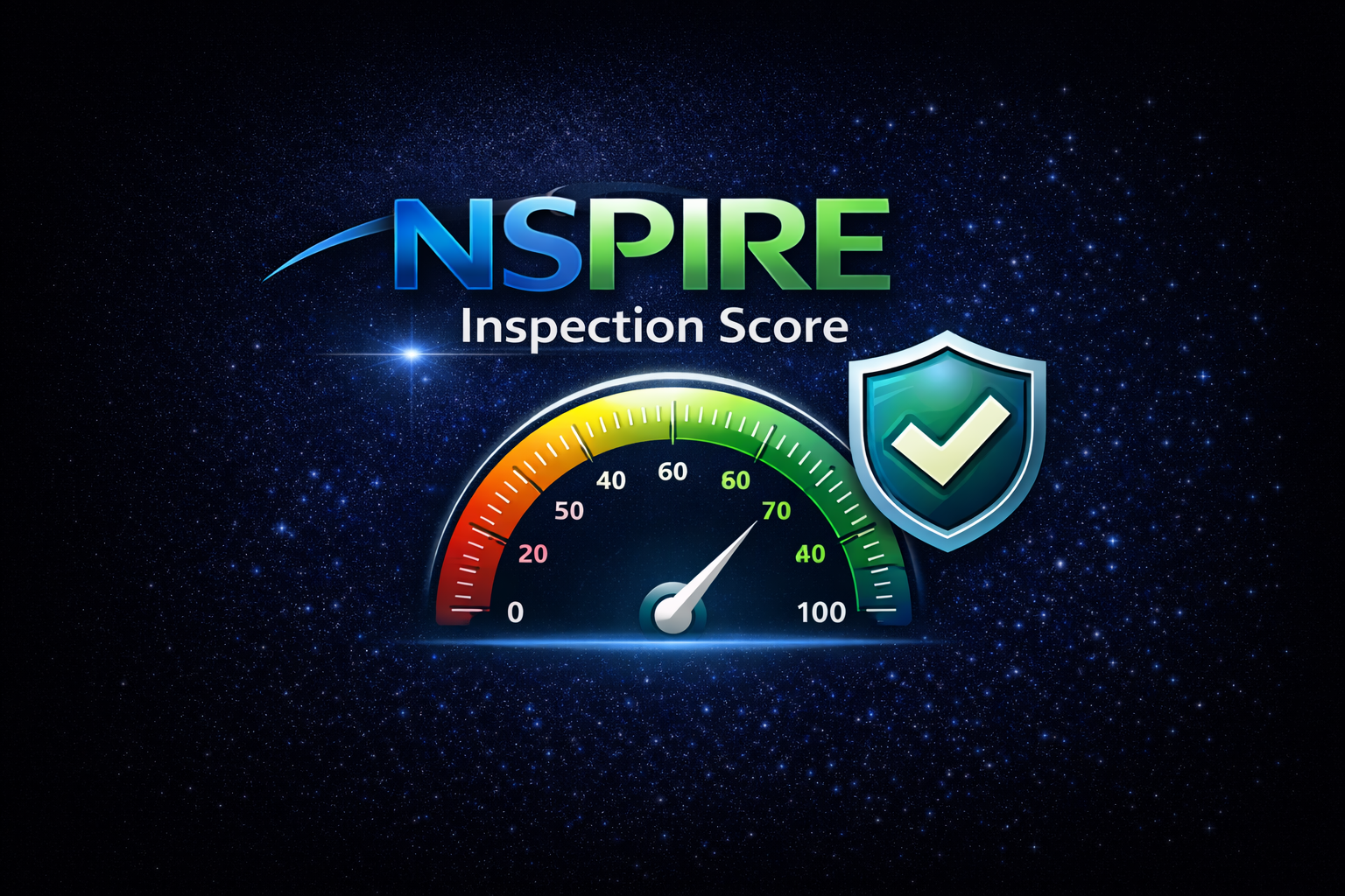
Measures point-in-time compliance
Scores 70 and above generally indicate a passing inspection
Further right = stronger inspection outcome
The Vertical Axis (Bottom → Top):
Measures how risk behaves over time
Higher values mean risk is escalating or uncontrolled
This score reflects patterns, recurrence, and exposure, not cosmetic conditions
The Two Critical Reference Lines
Vertical Dashed Line — NSPIRE Passing Threshold
Left of the line: failed or borderline inspection
Right of the line: passed inspection
Horizontal Dotted Line — Governance Threshold
Below the line: risk is generally controlled
Above the line: governance is required to prevent regression
This is the most important line on the chart. Properties above it carry increasing exposure—even if they passed inspection.
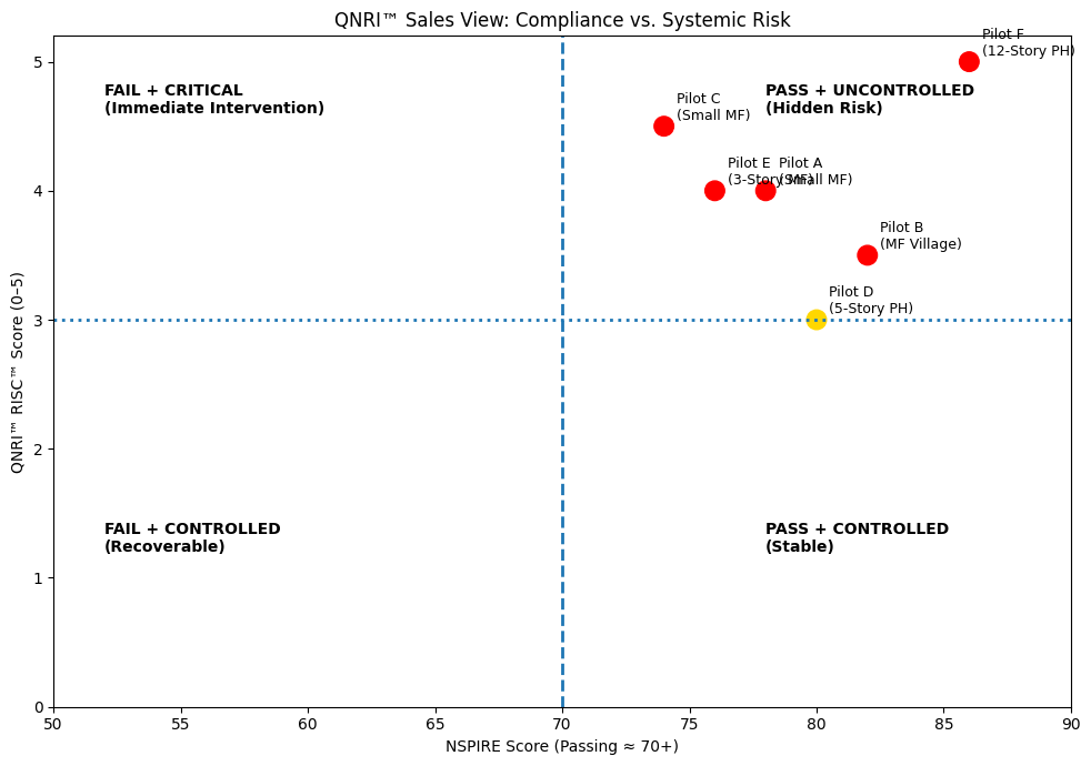
What the Colors Mean
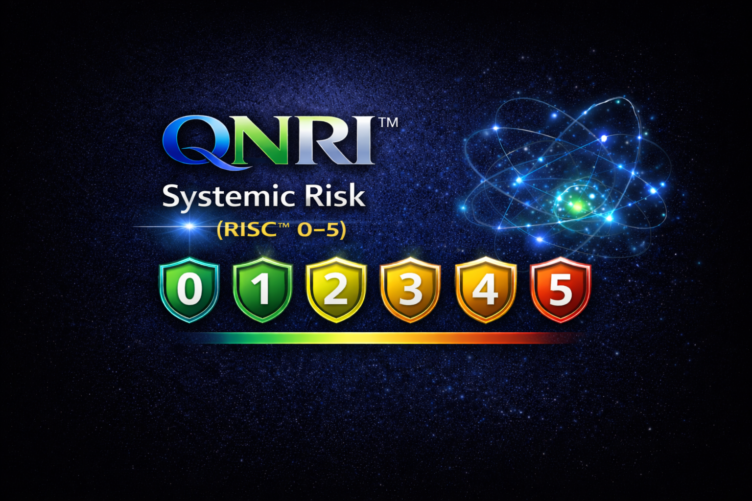
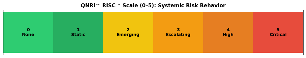
🟢 Green — Risk controlled (static)
🟡 Yellow — Risk escalating (monitor and govern)
🔴 Red — Critical systemic risk (intervention required)
What This Chart Reveals
Most pilot properties fall into the “Passed Inspection, Risk Escalating” zone.
This shows a consistent pattern:
NSPIRE confirms whether a property passes today.
QNRI™ reveals whether that pass will hold tomorrow.
The 12-story high-rise pilot is a clear example:
Strong NSPIRE score
Highest systemic risk score
Compliance was achieved — but risk remained uncontrolled.
Why This Matters
NSPIRE is designed to identify and correct immediate hazards.
QNRI™ is designed to govern what happens between inspections, where most repeat findings, emergency repairs, and liability exposure occur.
Together, they provide a complete picture.